[SPOTTED] Another fun game for designers. By Geoff Teehan.
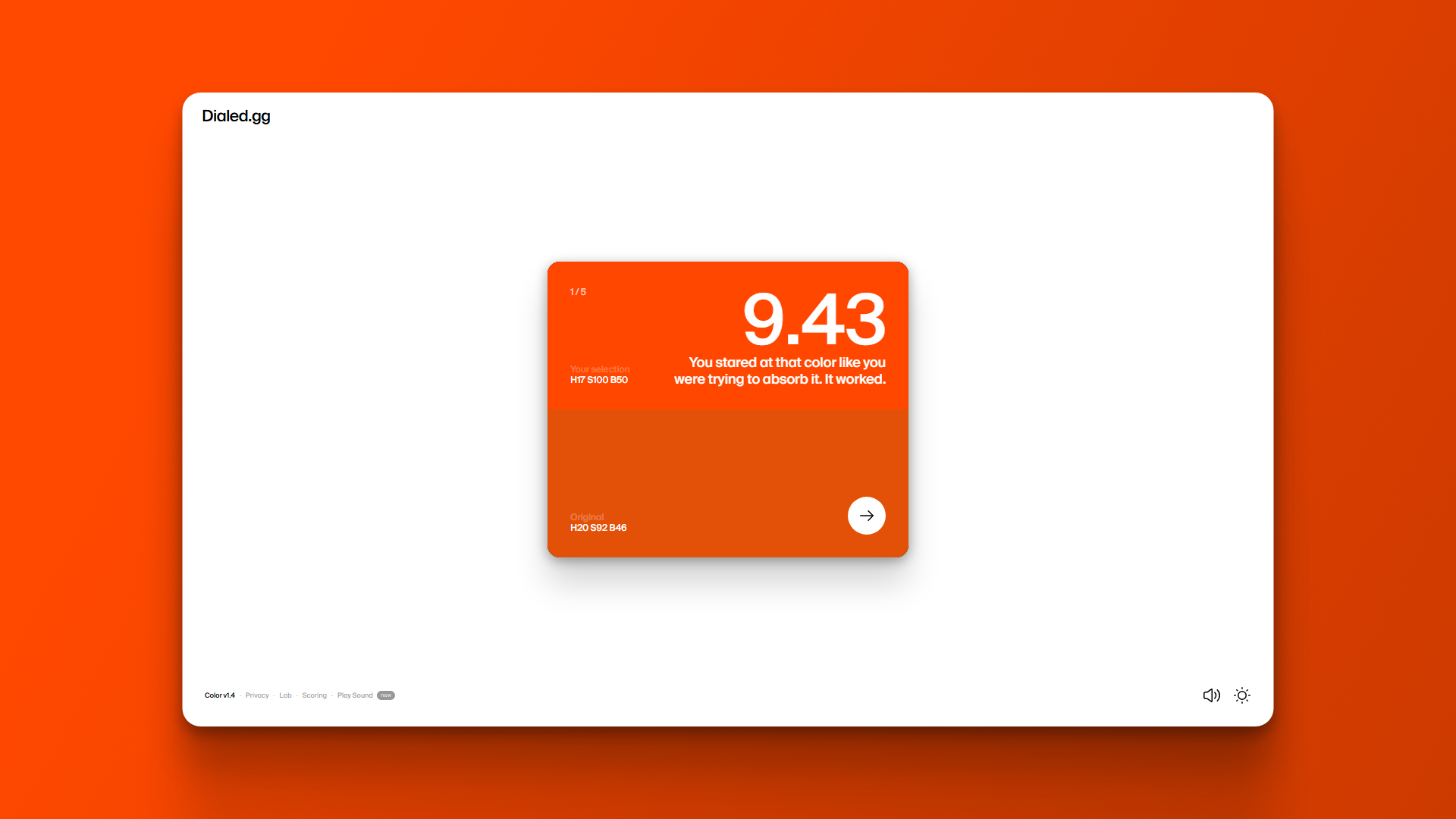
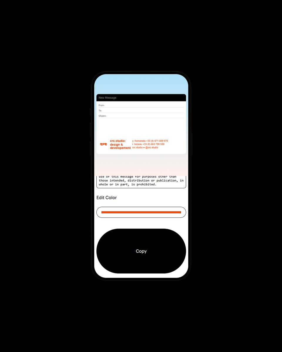
This simple challenge tests your memory: you’re shown five colors, then asked to recreate them from scratch.
● More: dialed.gg
This simple challenge tests your memory: you’re shown five colors, then asked to recreate them from scratch.
● More: dialed.gg